If you are thinking you want to learn how to better convey your message in your eLearning Font, then you're at the right place. We all know typography is important, but you might NOT know how important typography hierarchy is when displaying content. I suggest you start by asking yourself a few questions:
- What’s the message I want to get across to my audience?
- Who is my target audience?
- How old are they?
- What are they like? Etc.
Once you decide a typographic hierarchy, you'll have a better idea what fonts to use and why. Then you can start using the four main eLearning font categories.
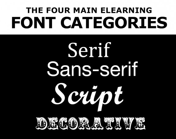
The Four Main eLearning Font Categories
There are four eLearning font categories to consider when designing your layout. Serif, sans-serif, script and decorative.
1. Serif Fonts

Serif fonts have a small decorative or embellished lines added to each character (or letter).
2. Sans-serif Fonts

Sans-serif means without serifs and do not contain embellishments.
3. Script Fonts

Script fonts look like handwriting and work more with headlines.
4. Decorative Fonts
![]()
Decorative fonts are typically used in headlines and designed as a graphical element, artwork, or image part of the message.
Which Font Should I Use for My Content?
Serif or sans-serifs are best used for body content. While coming up with your title, think about which words should be large, which words should be smaller, and where images could or could not be placed.
Remember to Be Consistent
Be consistent within your design, especially in text-heavy design. Make sure to keep font sizes the same size and be careful how many fonts you use. It's okay to use different font cases (like UPPER CASE and lower case), but not too much because it will begin to look weird. Use colors that go along with imagery, and match or draw attention where needed.
Differentiate Text in Your Title, Subtitle, and Body
Play with font size while designing with different fonts. Match colors to main content ideas and experiment with font size. While reading on a desktop or laptop the standard font size is typically 12-point font and you should never go below 10 point.
Extra Tip: Figure out your target audience and design for their needs. For example, with an audience that uses tablets and phones, a suitable font size is 14-point to 16-point.
Always Give Enough White Space
Did you know the correct use of white space in your layout will keep content readable? I use about 15-40% of my page as text content, and the rest (60-85%) will be my text hierarchy and imagery. So, use white space for visual separation between titles, subtitles, content, and artwork. It will make your course look so much better. Plus, effective use of white space helps the learner with organization and maintain a natural flow for the reader.
Want to learn more eLearning Font and Graphic Design tips? You should read our three part series: