

This week, Chris Van Wingerden, Sr. VP Learning Solutions at dominKnow, joined us to talk about responsive web design. If you want to develop content that is meaningful, accessible, and maintainable on multiple devices and platforms, responsive design is your holy grail.
Before Responsive Web Design, There Was...
Let’s go back in time to the early years of the web. The first web design approaches were all based on models for print media. In the print world, you always know how big your page, or poster, or billboard is. Thus, design programs evolved to be very focused on controlling the placement and design. Early web design followed the same model, substituting screen width and height for page size.
This was fine when we were mostly all looking at the web through similarly sized monitors. When smartphones took over, the initial response was to just specify a new page size and have browsers detect the device and either deliver the computer screen sized design or the phone sized design. As strategies go, this wasn’t the worst.
But we all know how this goes, right? Nowadays, we have tons of different devices with wildly varied screen sizes, and that’s without even considering screen rotation.
Responsive Web Design changed everything.
Responsive Web Design ISN’T:
- Just making images and text smaller
- Making multiple versions of the same page
Responsive Web Design is a reflection of how the web actually works. Designs are adapted to be built as a fluid grid and utilize media queries that determine screen sizes as a page loads. Below is an example of the same content adapting to different device sizes, first a desktop monitor, then a phone:
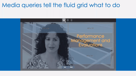

Think of the fluid grid as those tile puzzles you had as a child, where you slide the tiles around to unscramble a picture.

Chris shared many different examples of responsive web pages during the webinar. Using responsive web design, designers have new ways to tell stories on the web.
Tips for Building eLearning Using Responsive Design Method
- Design for screen width, not devices
- Design from smallest out
- Aim for functional equivalency, not full equivalency
- Simple tends to be better
- Build in time for QA across more devices
Watch the webinar recording to see more examples of responsive web design and how it can be applied to eLearning:
Feeling inspired? Sign up for a free 7-day trial of the eLearning Brothers Asset Library to download graphics, audio and visual clips, and cutout characters. We have all the resources you need to create amazing responsive eLearning!