
In the last post I wrote, I detailed how we’ve updated and simplified xAPI to make capturing your learner data even simpler—automated, even.
Check out that post , if you haven’t already. This will be a companion piece to that post.
As a developer, I’m pretty stoked on the xAPI cool factor we’ve built into our course starter templates.
Rapid authoring tools, straight off-the-shelf, sending custom, customizable statements that also happen to be automated and require no post-publish nonsense?
Sign me up.
But, as a designer, I’m left with one big, hairy question:
So what?
Or, more specifically:
While it’s certainly neat that xAPI can provide info on my learner’s behaviors, what exactly does that really mean? It provides data...sure. What, though? And how can I use it?
That’s a pretty fair question, really.
And one that parallels conversations we’re just now starting to see folks have about the spec in the industry. xAPI has matured, and most eLearning designers/developers are aware of it, at least conceptually.
We even dedicated an entire week to it during eLBX Online 2019.
Most of the examples we see about xAPI are pretty grand. While very cool, and very enlightening, they are not often particularly practical for, or applicable to, the everyday designer/developer.
Today, I’m going to share some examples of what practical, everyday data can be grabbed from rapid authoring tools like Captivate and Storyline using our templates.
Back to the main question, then: So what?
This:
With extremely minimal effort, you can use xAPI to get data on every click, swipe, matched dragger, decision, drop-off, answer, failure, success...you name it...that your learners take.
Not only can you see this by individual user, you can also view trends across the entire course, on each slide, or on each individual object. And, since many LRSs provide analytics dashboards, pretty much all of it can be charted with equally minimal effort.
So let’s look at an example now to make this a little more tangible.
Yesterday, I took one of our free courses from our Customizable Courseware Storyline library, and added xAPI triggers in a few spots using the method we include in our course starters.
Then, I published and added my output to our website behind a simple login page, and sent it out to a few folks in the company. You can view the course, and feel free to take it too!
And now I can see what everybody did, thanks to the power of xAPI!
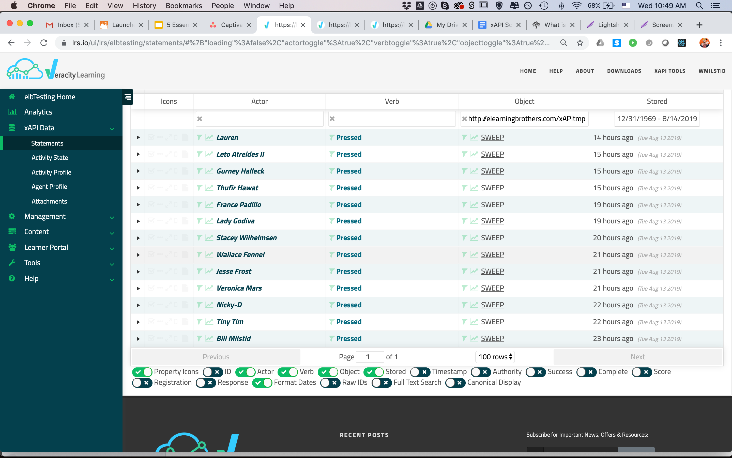
Statement Viewer
Click for Statement Viewer Example
The statement viewer above is a limited example that only shows the statements sent when an actor attempted/passed/failed/completed the course.
But if I look at the viewer for the LRS, I can see every other statement that was sent as well!
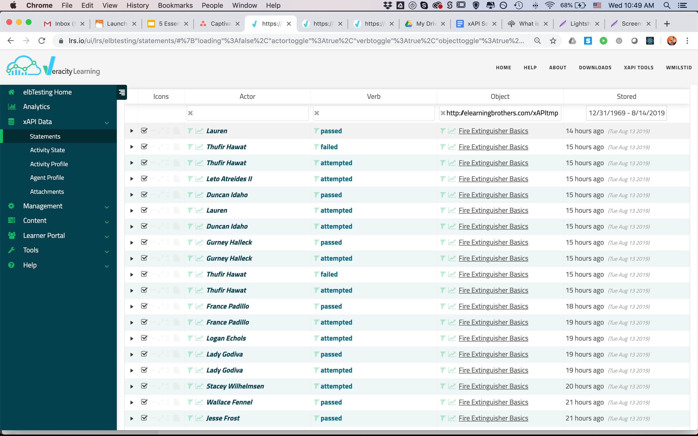
I didn’t set you up a live link for this one for a couple reasons, but here’s the screenshot proof:
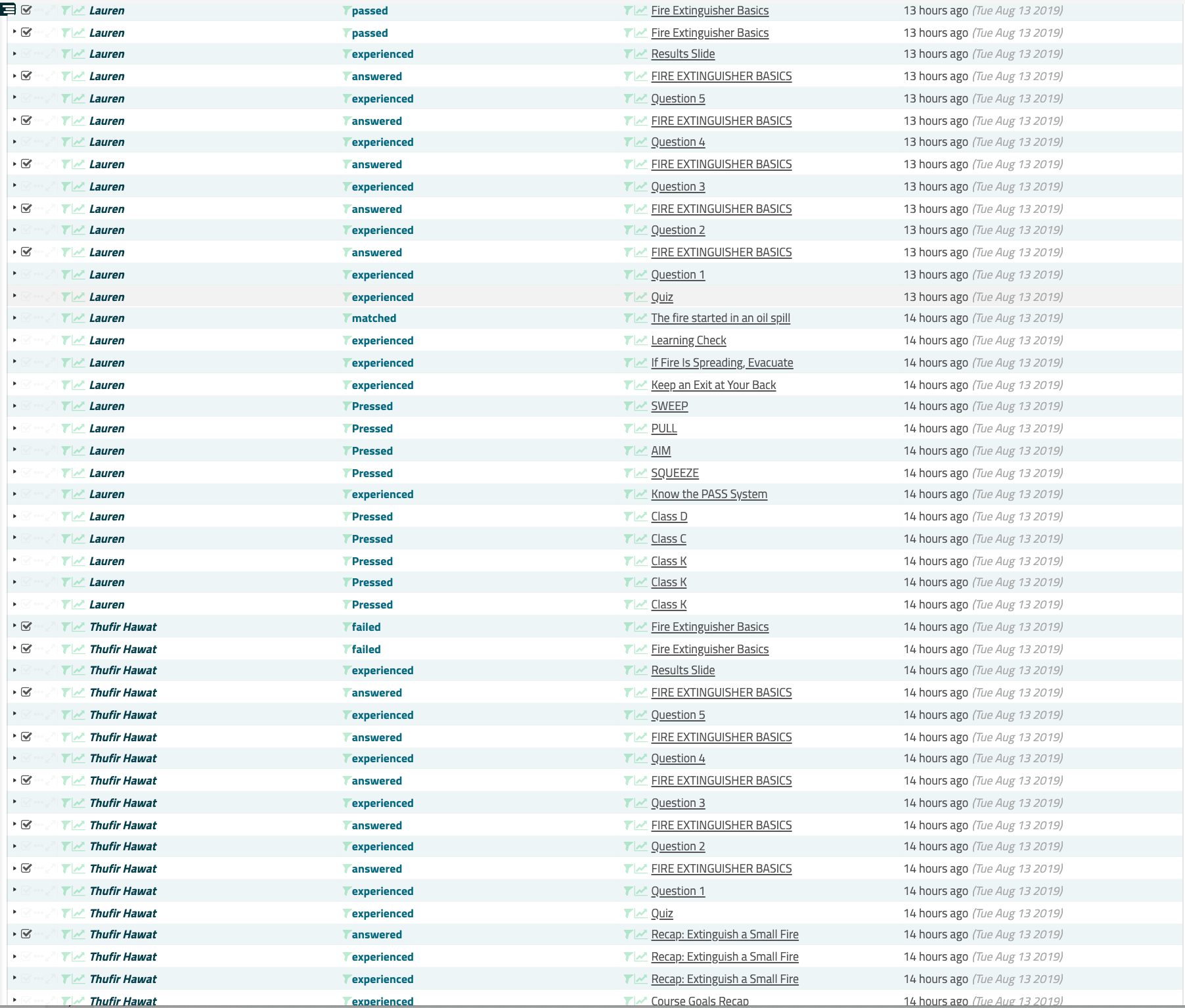
Personally, I find that cool on its own.
I can watch where each user goes in the course, in real-time, and, I can see some details about actions on a slide that Storyline doesn’t provide natively:
**
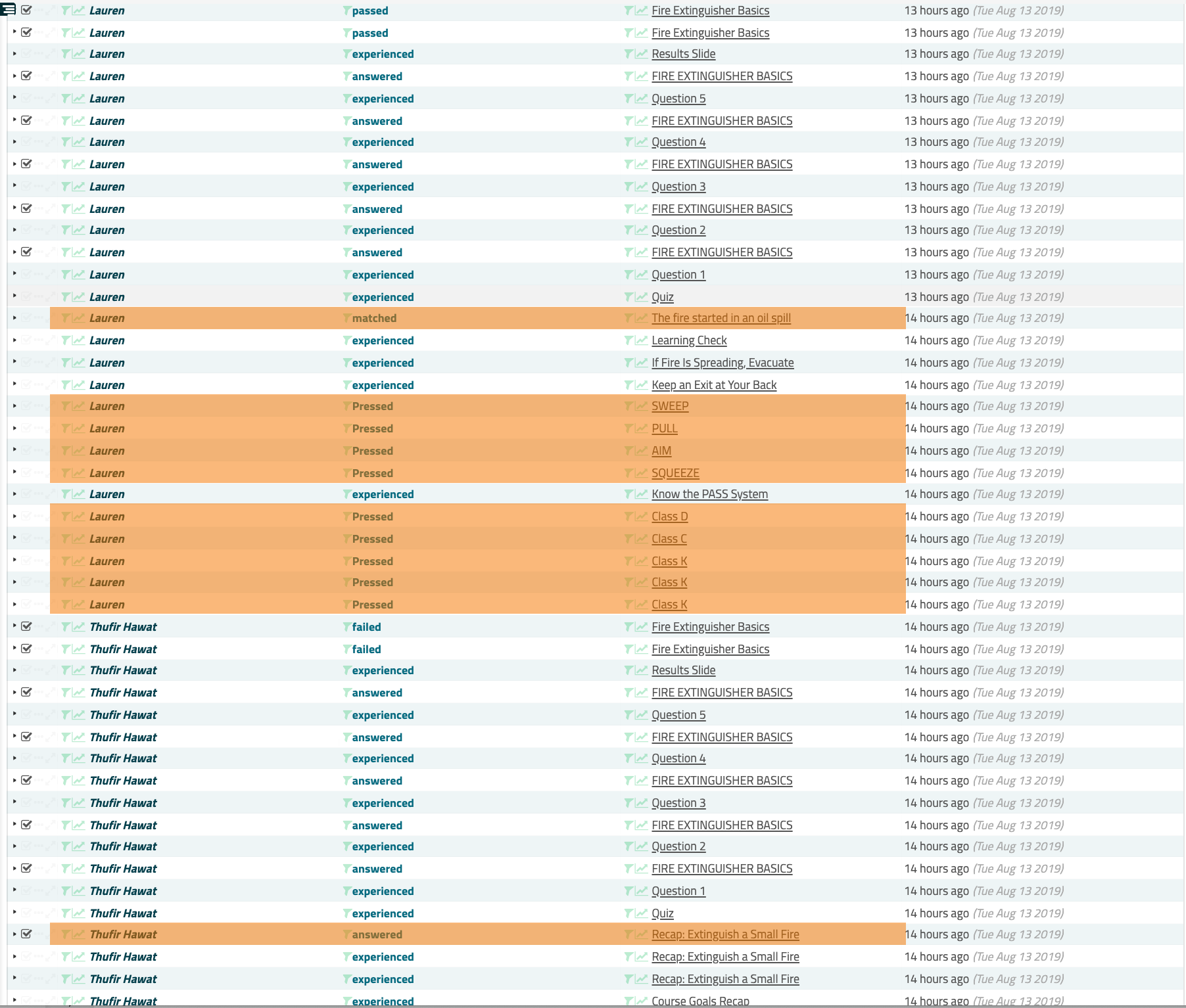
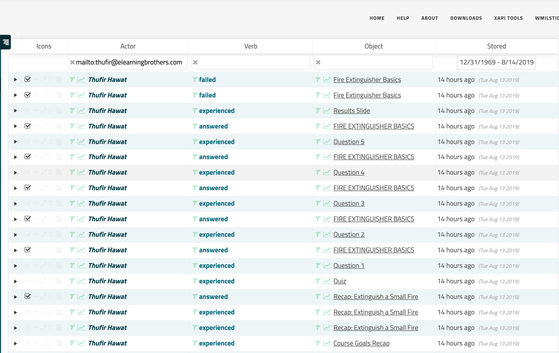
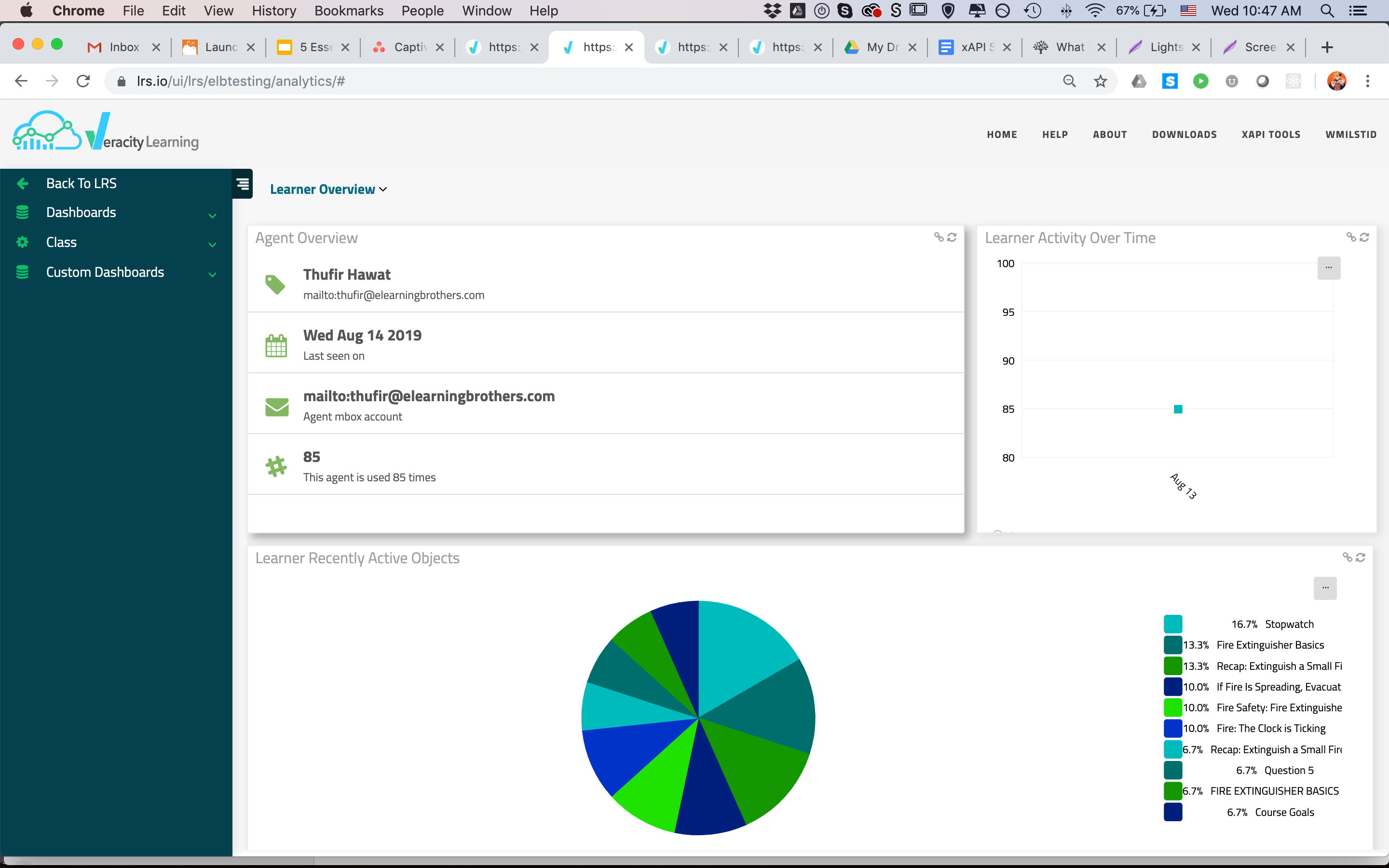
I can also drill down to the individual user by filtering on their ID:
Or by viewing their activity dashboard:
Similarly, our LRS (Veracity) allows us to filter on object ID.
Here’s our statement viewer filtered for an object of a custom button from our course:
Here’s the viewer filtered on the object ID of the entire course:
For general tracking, troubleshooting, and at-a-glance review, this sort of plain text display is really nice, as compared to many LMS reports I’ve seen. And it often includes more information.
But more important to designers is probably the dashboard functionality for individual objects.
Just like I did for an individual user, I can pull up a dashboard for every object that has a unique ID in our statements. This means buttons, slides, the course—all of it.
Object Dashboard
For example, here is the dashboard that Veracity provides—with a single click—for the sample course.
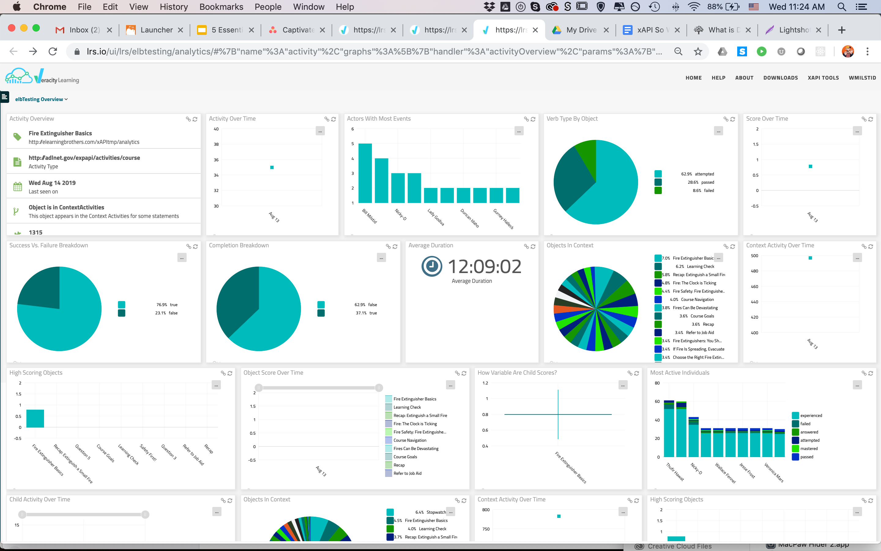
There are a number of things I can see at-a-glance, in this view.
For starters, I can see which actors have the most events.
Because of the way the course reports, and the way this chart is designed, I know that these events will be course-level attempted/passed/failed/completed statements.
Click to See Actors With Most Events
In this case, I see that Bill Milstid (that’s me!) has the most events, followed closely by Thufir Hawat. The rest of the actors all have about the same number of events—looks like the average is 2. Given what these events represent, I can infer that Bill and Thufir needed to access the course a few more times than most folks. If this were a real course, I might think about looking a little further into their progress records, or maybe even reaching out to them to check on comprehension, get a feel for their experience with the program, etc.
I can also very quickly see that 8.6% of the statements coming in for this course are “failed” statements. This doesn’t directly translate to percentage of learners, but it does point out something worth taking a peek at.
Click to See Passed/Failed/Attempted Breakdown
More importantly, though, it looks like only 28.6% of my statements are passing.
There are a couple different ways to use this information.
The way my particular brain works is this: I’d expect this chart to be about 50/50 attempted and completion statements. Seeing that my completion statements total up to less than that tells me we’ve got some learner drop-off happening somewhere along the way.
A quick check of the completion chart confirms:
That’s something I’d like to look into.
There’s certainly more to be gleaned from that view, but for the sake of time, let’s move on.
Slide Level Data
If I need to, I can also drill down to the slide level. Here’s an overview of the PASS system interaction:
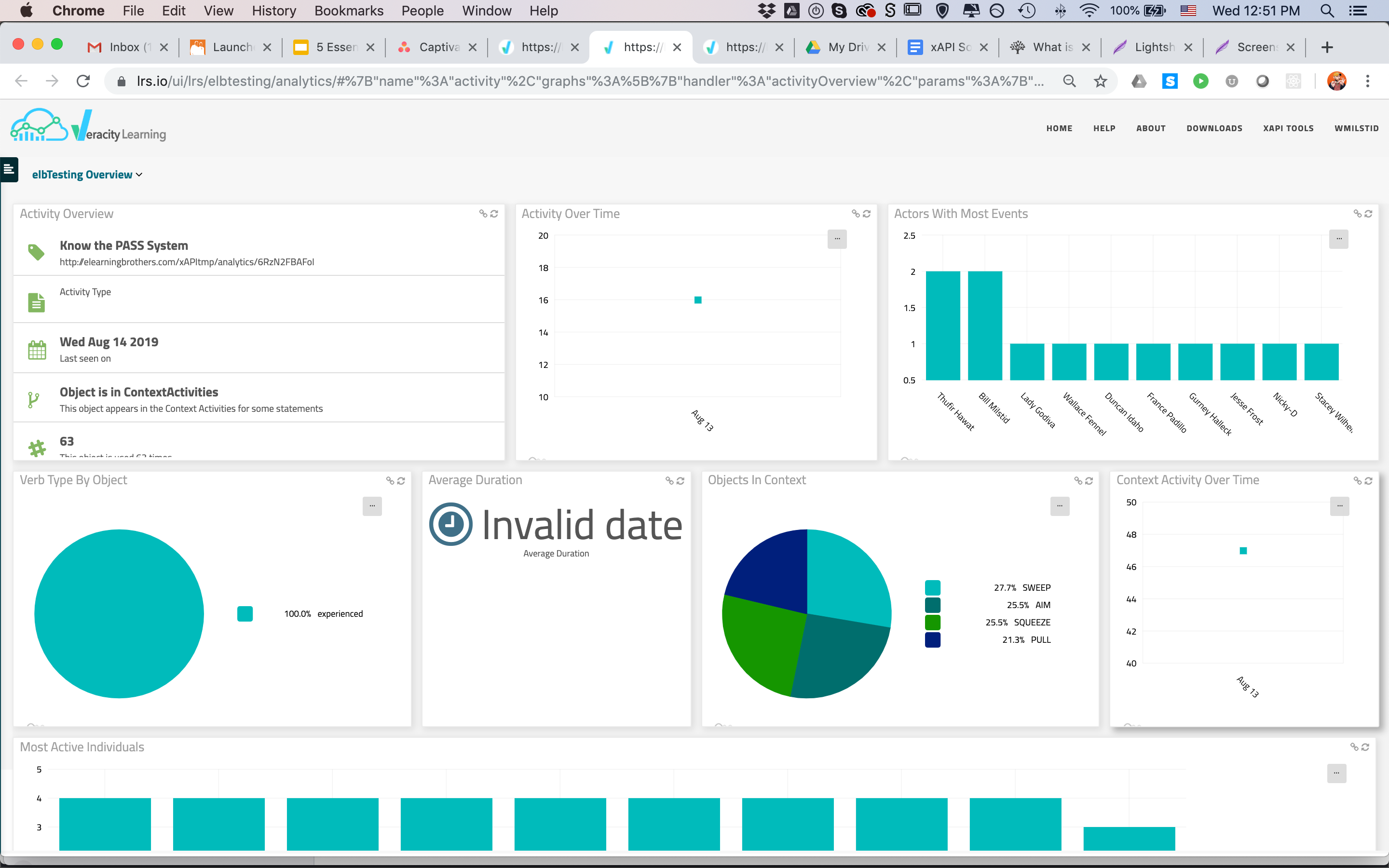
This dashboard, like the course-level dashboard, also provides info on actors, duration, verbs, and the like.
Probably most valuable though, is the Objects in Context chart:
Click to See Objects in Context Chart
This chart uses the context data included in custom statements sent by our templates to display individual interactive objects related to this slide.
In this particular case, we have 4 buttons on the slide that the user can press. When they choose a button, we reveal content and send a custom statement that indicates they pressed that particular button. The verb here could be anything that makes the most sense to you contextually; it indicates that they interacted with that particular content.
Looking at this chart, then, I can see that content is pretty evenly split on this interaction. Folks are, for the most part, reviewing all 4 buttons on the page each visit. If this were dramatically off—say one item with 60% of statements—I’d want to investigate what was going on.
We can also drill down to the object level with our dashboards to see stats about an individual button, dragger, etc. It follows a pretty similar pattern to what we’ve seen so far.
That’s a lot of out-of-the-box data.
But wait! There’s more!
You can also create custom dashboards and reports to visualize data that doesn’t show up how you’d like it by default. In the Veracity Analytics section, there’s a Custom Dashboards option that allows you to create your own charts on whichever elements you’d like. This can get pretty powerful.
For example, here’s a custom chart showing the responses to the Recap text entry activity in our sample course:
Click to See Custom Response Breakdown Chart
It looks like everyone’s responses were pretty unique on this one. Some of those clearly are unrelated to the subject matter, so I might want to followup on those. I can also see that I only have 10 responses. Since I know more than 10 folks visited the course, I know I’ve got some participation issues on this slide I need to address.
Similarly, I wanted to know exactly which answers on the drag and drop we use in this course were most popular. There are a few different ways I could set up reporting to show this, but for this post, I decided to simply set up individual bar charts showing the number of times each of my draggers was correctly matched.
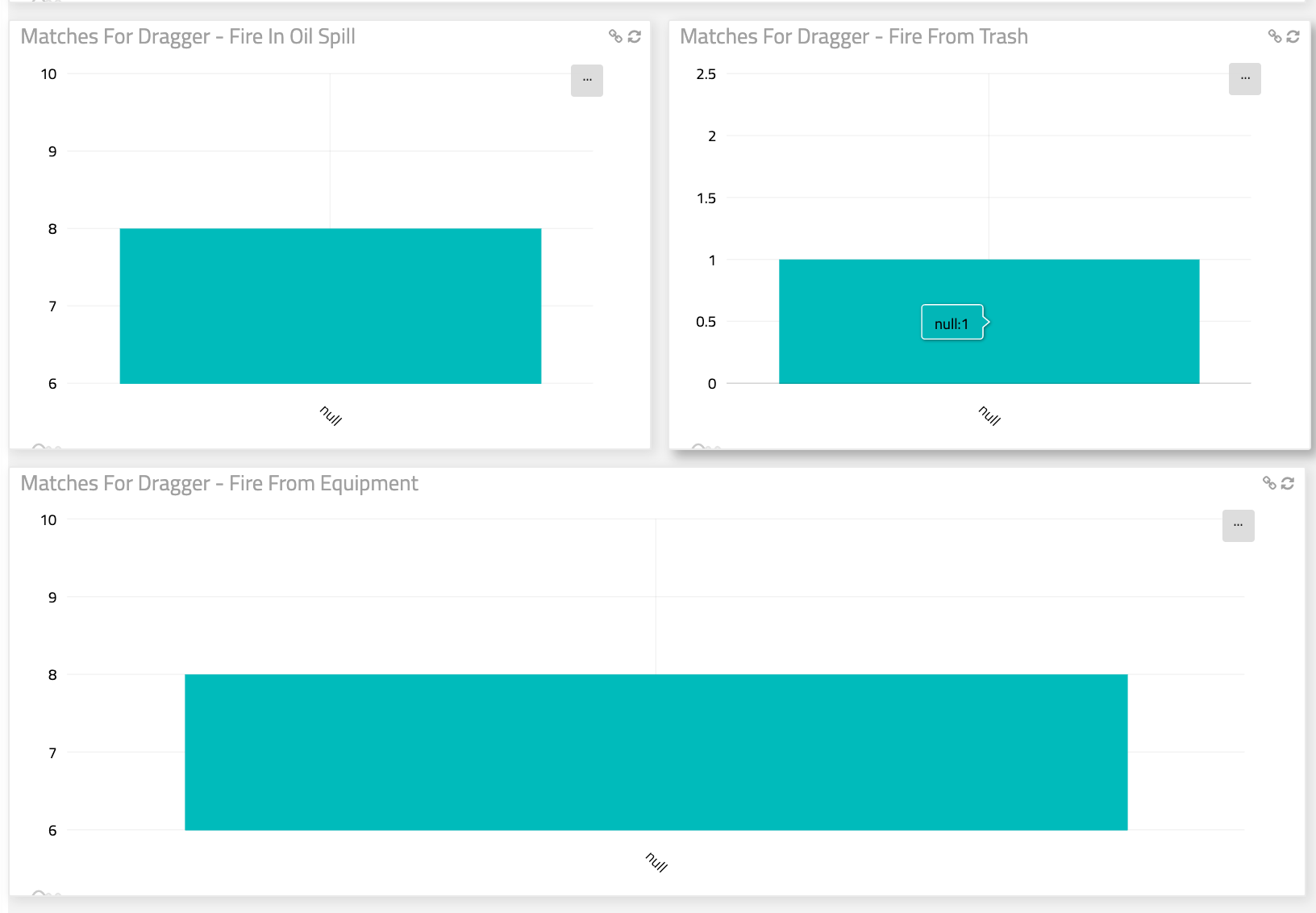
From these, I can plainly see that I’ve got about the same number of responses for draggers 1 & 3, but that dragger 2 was only matched correctly 1 time. That’s an odd proportion. If it’s accurate, and assuming this was a reasonable sample size, I’d consider evaluating the content that led to this interaction. I also might want to look at completion on this slide to address the proportion of matches.
I could keep going.
Probably for a pretty long while, really. There’s tons we could cover on this subject.
And were this a more involved course with more substantial interactions, we probably would.
The point is, though, that xAPI can be used quickly and easily in a practical, day-to-day manner to evaluate and help improve your courses substantially...without impacting your workflow.
Hopefully this little example—which, by the way, took me all of about an hour to pull together, publish, upload, test, and send out to my users—gives you some insight into how.
If you’d like to learn more about xAPI, visit our blog and support site for more articles, take a look at our Course Starters for a quick and easy entry into xAPI for your current projects, or contact our custom department to find out how we can build something rocking for you.
Thanks!
~Bill
Not a member yet? Sign up for a free 7-day trial to access the entire eLearning Brothers Asset Library.

**Note that I did not add a ton of custom statements into this course. Just a few to illustrate the basics. If you do have a course with many more, you really start to see trends in slide-level content pop.