Good design is essential for effective communication. As eLearning designers and developers, we are constantly looking for the right visual elements to communicate our course's message.
But, we also want our courses to look good, right?
Sure, a bold, black subhead and some bullets on a white background will effectively communicate the most important points on your slide, but it's a little boring. Learner engagement is the name of the game and basic slides aren't going to cut it. What if you could make content stand out in a more visually exciting way? You could do this by picking a good typeface combination that makes headlines stand out from body copy, or using a consistent visual hierarchy throughout your course.
To achieve that perfect typeface pairing or elegant visual hierarchy, you need a solid understanding of some typography and graphic design foundations.
We hosted a webinar with Nic Brown, our Director of Product and Design, that broke down basic strategies for laying out content, picking typefaces, and some more advanced typography do's and don'ts. Nic shared tons of great tips in that webinar, and you can view the recording anytime, but we wanted to make it easier for eLearning developers to reference those layout and typography strategies.
So we compiled them all into an eBook and it's available for you to download—for free—right now!
Get the Layout & Typography Tips for eLearning Designs eBook now.

This free eBook covers:
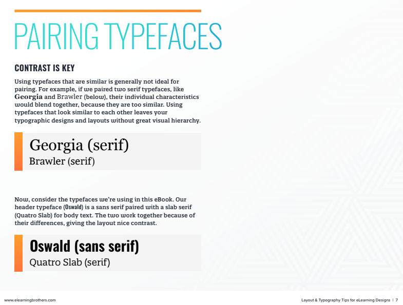
- Pairing Typefaces
- Visual Hierarchy
- Grid Layouts
- Alignment
- Line Spacing
- Widows and Orphans
- And more!
Every topic includes visual examples that you can draw from in your own eLearning design and development. Here's a sneak peek:
Download the free Layout & Typography Tips for eLearning Designs eBook now.